Presenting data as a graph can help share a lot of information quickly. And sometimes if a viewer looks too quickly they might miss something. However, the risk of being data duped is compounded by typical errors in composition. Scale, orientation, choices of which data to place on the X and Y axis and many times presenting too much data, makes it difficult to interpret.
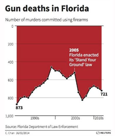
Here is a classic example created by Reuters in 2014. Shortly after Florida made some changes to their gun laws, the data shows the number of gun related deaths. However, by flipping the Y axis is seems at first glance to show a decrease in deaths, but the numbers show otherwise. A true Data Duped for their readers.
Published by Derek W Gibson
I am a practitioner and adjunct professor working at the intersection of AI strategy, analytics governance, and the responsible use of data.
I bridge AI strategy and enterprise execution, where I have been a leader in analytics risk governance at Wells Fargo while shaping the next generation of AI professionals as an Adjunct Professor at Wake Forest University. With 30+ years of driving data-driven transformation, I specialize in turning complex analytics challenges into high-level strategy, regulatory compliance frameworks, and measurable business outcomes.
I have applied numbers to problems and, through experience, discovered a few problems with numbers. Through this work, I have confronted firsthand the challenges of data misuse and misinformation, experiences that led me to co-author Data Duped: How to Avoid Being Hoodwinked by Misinformation with Jeffrey D. Camm, published by Rowman & Littlefield (Bloomsbury)
View all posts by Derek W Gibson